print · September 3, 2026
Leaflets in One Colour
One ink, one sheet, one fold. What a single colour forces you to decide, and the five layout choices that make a cheap leaflet look like it was designed on purpose.
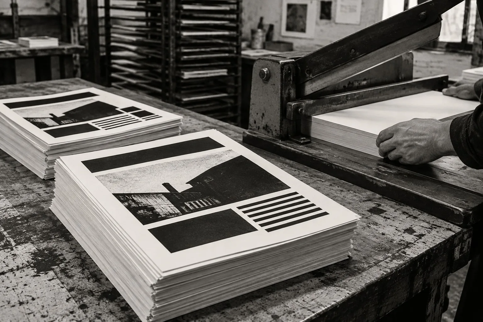
Two hundred leaflets, one ink, one afternoon. Our printer charges by the colour, and the cheapest colour is black. We used to treat that as a limit. Now we treat it as a method.
Here is what one colour teaches you.
Hierarchy comes from size, not colour
With one ink you can't shout in red. You have size, weight and space, and that's enough. Pick a headline so large it feels slightly rude. Pick a body size so small it feels honest. Leave the middle empty.
The test is simple. Pin the leaflet to a wall, stand across the room and squint. You should be able to read exactly one thing. If you can read three, you have no headline.
Use the paper
The paper is your second colour. Cream or grey stock under black ink looks warmer and more expensive than white, and it costs a few pence more per sheet. Let it show. Don't print a solid block across the whole page unless you want a bad hour with the printer's rollers.
Margins are where a cheap leaflet starts to look chosen. Give the text a full centimetre more than seems reasonable. Crowded edges read as nervous. Wide ones read as certain.
Halftones for depth
A photograph in one colour looks muddy unless you break it into dots. Turn the image to high contrast, then apply a coarse halftone, big enough that you can see the dots from an arm's length away. It reads as a decision. A smooth grey reads as an accident.
Keep the picture to one per sheet. A second image starts an argument with the first.
The fold does the pacing
A single fold in three gives you a front, a reveal and a back. The front carries the headline. The reveal, the panel you see when you open it, carries the one thing you actually want to say. The back carries the date, the place and the way to get in touch.
Plan the order before you write a word. People open a leaflet the way they open a letter, slowly and suspiciously, and you can use that.
Cut the words
Whatever you wrote, cut a third. Then cut the last sentence. A leaflet is a handshake, not a lecture, and nobody has ever finished reading a leaflet that ran to two hundred words.
One ink forgives nothing and permits everything.
That's pinned over our cutting table, and it's the only design theory we own.
And the bill? Not much. Two hundred copies, black on cream, folded in three, cost us less than a good dinner. The real price is the thinking you have to do before you press go, and that is precisely the point.
Try it with the next thing you want people to read.
Names, places and events in this demo are fictional.
No comments yet
Comments are open. Have a thought or a question? Share it below.